New font Dyslexie makes reading so much easier
Christina Drill
November 11, 2014
Let me introduce you to Dyslexie, a computer font that will make it infinitely easier for people who suffer from dyslexia to read on the computer.
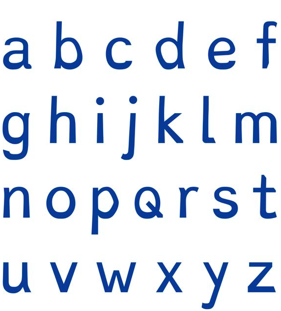
Designed by Dutch designer Christian Boer, Dyslexie makes reading an easier, more enjoyable experience for people with dyslexia. Compared to other fonts, which Boer explains are designed "solely from an aesthetic point of view" which results in a lot of letters having similar strokes and curves, Dyslexie boasts heavier base lines, different tail lengths on letters, larger openings, wider spacing, and slanting. Basically, what Dyslexie does so well is make each letter and number distinguishable from the rest, even when "d"s so closely resemble "b"s and etcetera.
As of right now, Dyslexie is being featured as part of the Istanbul Design Biennial, but Boer came up with the idea in University as part of his Utrecht Art Academy thesis back in '08. It is free to download the font, and once you do, you can install it as the primary font for browsing the web, writing emails, and printing out documents.
Boer himself is dyslexic, and he explains his inspiration behind the font-- "[Other fonts] often have the characteristics that make characters difficult to recognize for people with dyslexia. Oftentimes, the letters of a word are confused, turned around, or jumbled up because they look too similar."
So far, Boer estimates that over 12,000 people have downloaded the font to their computers. Dyslexie is also being used within big-name corporations-- Shell, Citibank, Pixar, and Nintendo, to name a few. A variety of e-books and print books are also available in the font.